How software gets color wrong
Most software around us today are decent at accurately displaying colors. Processing of colors is another story unfortunately, and is often done badly.
To understand what the problem is, let’s start with an example of three ways of blending green and magenta:
- Perceptual blend – A smooth transition using a model designed to mimic human perception of color. The blending is done so that the perceived brightness and color varies smoothly and evenly.
- Linear blend – A model for blending color based on how light behaves physically. This type of blending can occur in many ways naturally, for example when colors are blended together by focus blur in a camera or when viewing a pattern of two colors at a distance.
- sRGB blend – This is how colors would normally be blended in computer software, using sRGB to represent the colors.
The example only reads correctly if you have a reasonably calibrated display and trichromatic color vision.
As you can see, the sRGB example looks quite different. As the colors blend they shift to be much darker and bluer. Why is the standard way for blending colors different from both human perception and the physical behavior of light?
As it turns out, the reason is that the color representation used in most software is based on how CRT displays in the 1990s worked. How color processing works is just a consequence of that representation. Because of this, working with color in software is harder than it needs to be and there are many unnecessary pitfalls working with image processing.
The rest of this post will cover the basics of how color perception works, how it is modelled in software and how almost all software, doing any sort of color manipulation, gets color wrong.
In a series of follow up posts I will look at better ways of doing processing with color.
Introduction to color perception and color management
Skip this section if you are familiar with things like cone responses and the CIE 1931 XYZ color space
Color is a peculiar thing. Everyday and all around us we perceive color. It wouldn’t be odd to expect color to be simple to explain and that relating it to the world around us would be easy. Instead color perception is a complicated process that takes a spectrum of light through complex and non-linear transformations. Thankfully, centuries of research has produced a decent understanding of this process and models for predicting perception exist.
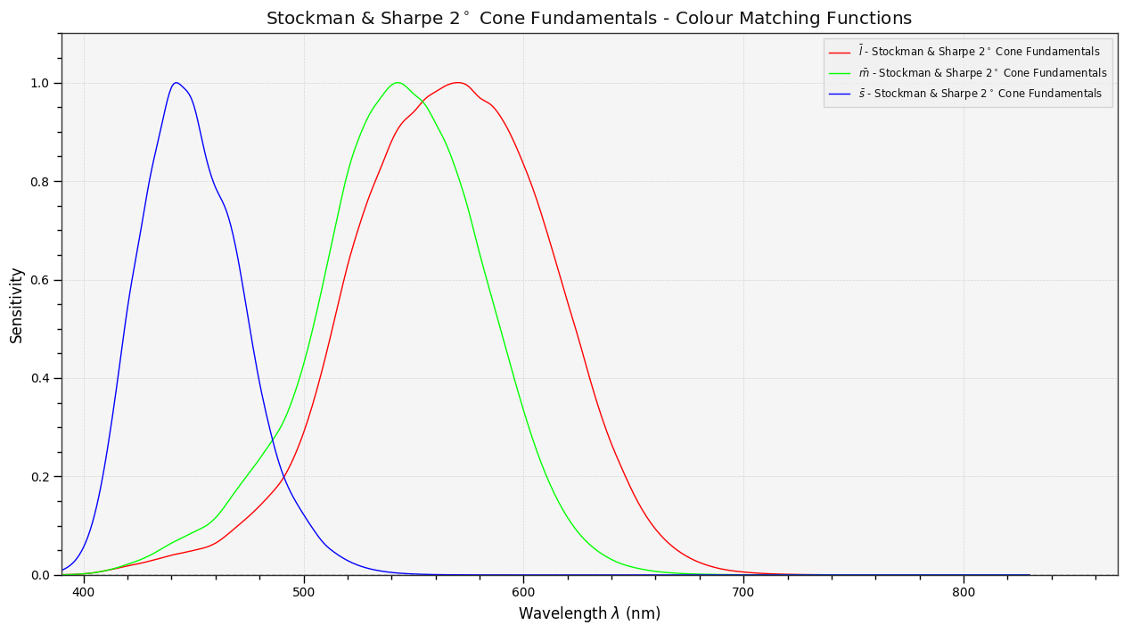
One key result is that our eyes don’t measure the full spectrum of light. Photoreceptor cells in the eye react to certain ranges of wavelengths, roughly corresponding to what we perceive as colors red, green and blue. The cells reacting to color are called cones. The different types of cones are referred to based on what wavelengths they are sensitive to: long, medium and short or LMS – long corresponds to red, medium to green and short to blue.
Light sensitivity for L, M and S cones for different wavelengths
A consequence of this is that many different light spectrums can result in the same perceived color, as long as the LMS response is the same. This is the basis for many everyday things: e.g. color displays produce a wide range of colors by combining red, green and blue light. Print works similarly by using cyan, magenta and yellow ink and color paint is made by mixing various pigments to achieve the desired color.
This also makes it possible to describe colors mathematically, by describing it as a mix of three primary colors. A standard exists for this called the CIE 1931 XYZ color space, which represents colors as three values: X, Y and Z
Another important result about human perception is that the mapping between perceptual qualities such as hue, brightness, colorfulness, etc. is not a fundamental property of light. The only way to numerically model them is by fitting non-linear models empirically to match human perception or by simulating human biology.
Representing color in software
To describe colors in software, conventions for describing colors with numerical values is needed. A specific way of mapping colors to numbers is called color space. Normally color spaces use three numbers to describe colors. RGB color spaces are the most common, with the three values representing red, green and blue light.
To describe a typical RGB color spaces a few things are needed: a set of red, green and blue primary colors and a non linear transfer function (sometimes referred to as gamma correction function). To represent a color in a color space two steps are performed:
- The light intensities for each of the three primary colors are calculated so that the perceived color matches the desired color. If the desired color is already represented as intensities of another set primary colors (such as the standard CIE 1931 XYZ color space), this transformation can be done with a 3x3 matrix multiplication:
- The calculated intensity for each primary is normalized and transformed using the non linear transfer function.
A common choice of the non linear transfer function is a power function: , with .
Examples of color spaces structured like this are: sRGB, Adobe RGB, P3, Rec2020 (although they don’t all use a power function).
Color gamut
The choice of which RGB primaries to use affects what portion of visible colors can be represented, referred to as color gamut. Choosing a wider color gamut means that more colors can be represented, but it also means that more data is needed to store colors with a high precision and that normal displays might not be able to show all the colors.
Non-linear transfer function
The reason for the non linear transfer function existing is a bit odd. Many of the commonly used color spaces today were originally designed with CRT displays in mind, or are derived from color spaces that were, and in CRT displays the relationship between voltage and brightness is non-linear. The transfer function is added to encode the colors so that they can be used directly to drive a CRT display, without additional processing.
A happy accident is that the same transfer function somewhat correlates with human perception of brightness. As a result colors encoded for CRT displays can be stored with fewer bits than ones stored linearly, which makes the encoding useful even though CRT screens are rarely used today.
Color management
To consistently reproduce color across devices, information about what color spaces are used needs to be encoded and color translated to the right color space for a device. This is referred to as color management.
Over the last couple of decades a lot of effort has gone into color management and this now works decently. Many displays today are calibrated fairly well out of the factory and a lot of software is built to correctly convert between color spaces as needed. Images typically have embedded color space information (using ICC profiles) which allows them to be accurately reproduced.
For applications not actively managing color sRGB has become the standard. This way, as long as the device and operating system correctly manage color, even applications without any explicit color management will work consistently. The web is a great example of this. Whenever you see a color defined as #DAF7A6, rgb(85%, 97%, 65%) or hsl(118, 52%, 65%), you are probably looking at a color in sRGB.
While there still are things to improve, color management overall is a success story.
Desirable operations with color
Before diving into how colors are processed in software today, let’s look at what types of operations with color make sense.
Common use cases for doing operations involving color in software are things like: realistically rendering images, stylizing photos, digital painting, manipulating photos, picking colors in a color picker, blending transparent elements and making color gradients etc.
To support that I can see three types of operations:
- Matching the behavior of real light and materials. E.g. Add artificial lens blur, add a layer of fog over an image, simulate light bouncing of a material, etc.
- Matching the human perception of color, to achieve intuitive and predictable control. E.g. Make a color more colorful, while keeping the hue and lightness constant.
- Stylized operations, producing interesting results but not grounded in realism or human perception. E.g. Operations like cross processing photographic film.
Color processing in software today
Given what we know about color, it would seem reasonable that process colors is done using representations designed to either mimic the real world interaction of color or human perception. Is this commonly done? Unfortunately not. Instead color spaces designed for reproducing colors are used for doing calculation with them. This is where the problems start appearing.
The most common approach is to simply use sRGB. In color managed software (such as Photoshop), the same color spaces are typically used for doing operations as for storing colors. This means that how operations with colors behave can be different from image to image, depending on the color space. It also means that changing color space to something that behaves better is possible, but this is not something most users do and it is hard to understand.
The result is that color processing, as normally implemented, neither capture how colors behave in the real world nor how humans perceive them – it is just a byproduct of how the color space has been defined! This why image processing behavior today is determined by how CRT displays used to work in the 90s.
Not all bad
To be fair things are slightly better than this in some specialized image processing software. Over the years ad-hoc functionality has been added here and there that better match human perception or the behavior of light. I’m also sure the developers are aware of the underlying issues, but taking a large step is probably impossible for them, since they need to keep backwards compatibility.
There is also one class of software that does this fairly well: Software for rendering realistic 3D images. Here the accuracy matters much more since they need to mimic the interaction of light to achieve acceptable results.
Two main approaches exist: doing computation using the RGB primaries of a color space, but without the non-linear transfer function and fully simulating the spectrum of light. The spectral approach is of course the most accurate, but also more costly. The RGB approach is completely accurate for operations and has been proven to be a reasonable trade-off practically.
Some studies have been made to compare rendering using linear RGB color spaces and full spectrums:
- Render Color Spaces - Anders Langlands
- Picture Perfect RGB Rendering Using Spectral Prefiltering and Sharp Color Primaries
Comparisons
Let’s look at some more examples of blending of colors, to see how these problems surface more practically. The examples use strong colors since then the differences are more pronounced. This is using the same three ways of blending colors as the first example.
White and green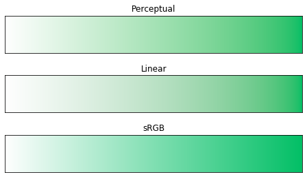
White and yellow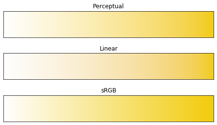
White and red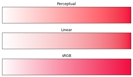
White and blue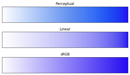
White and black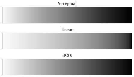
Blue and yellow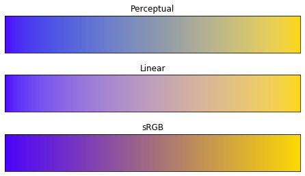
Cyan and red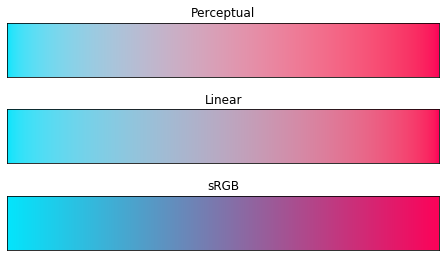
Green and magenta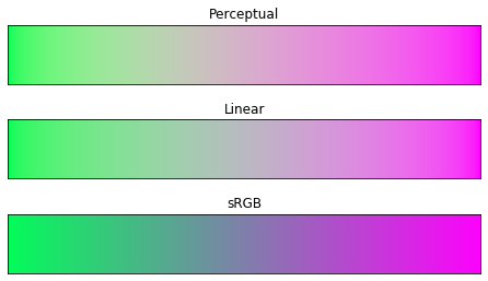
As the examples show, the differences are quite significant:
- Neither sRGB nor linear are able to blend colors with white and keep a constant perception of hue.
- sRGB darkens colors significantly when mixing saturated opposing colors
- sRGB and perceptual color spaces blend white and black similarly, while linear blending is much brighter. This is the reason sRGB sometimes is referred to being a perceptual color space, despite its other shortcomings.
Overall sRGB does not match color perception nor the physical behavior of light, which makes it unsuitable for image processing.
What about HSV and HSL?
For picking colors and sometimes editing images another representation is often used: HSL (hue, saturation, lightness) and HSV (hue, saturation, value). They are not actually color spaces, they are ways of remapping RGB color spaces to parameters that are easier to work with. This means they share the properties of the RGB color spaces they are based on, which also means they share their weaknesses. HSL and HSV representations of sRGB in particular are everywhere – almost all color pickers are based on this.
As an example, here is one by Google, that you can find by googling “color picker”:
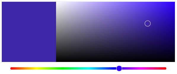
This blue color is again a clear example of a hue shift in sRGB. From the top right corner the hue shift to purple as the color gets lighter to the left, despite the HSL hue value staying constant.
If a perceptual model was used instead, the same color picker would look something like this:

What can we do?
The solution is simple at a high level: instead of relying on what color space a file or display uses, color operations should be done with the use case in mind, to either model human perception or the physical behavior of light.
Unfortunately doing this well in practice is quite complicated, which is probably part of the the reason it isn’t done often. Getting started is easier though.
One easy thing to do is to use a linear version of sRGB when doing any sort of blending, blurring, resizing or transparency blending. This can be done simply by applying the inverse of the sRGB nonlinear transform function, doing computations, then switching back. For colors in sRGB in range 0.0 to 1.0 this can be done by applying these functions component wise (provided in C-like pseudocode):
float f(float x)
{
    if (x >= 0.0031308)
        return (1.055) * x^(1.0/2.4) - 0.055
    else
        return 12.92 * x
}

float f_inv(float x)
{
    if (x >= 0.04045)
        return ((x + 0.055)/(1 + 0.055))^2.4
    else
        return x / 12.92
}
The same thing can also be done with color management libraries where available, which also helps when dealing with more color spaces.
Perceptual representations for image processing is a less explored area. There are models aimed at understanding color appearance that can be used for processing as well, but doing so isn’t without issues. A common problem is that models with high accuracy, also tend to be complicated, and when using them for image processing the results can be hard to predict for a user. This post has used OSA-UCS, but it also has drawbacks. The largest issue is that the conversion to the representation doesn’t have a closed-form inverse. More work is needed to find a suitable perceptual representation for image processing.
Conclusion
Instead of making it as easy as possible to work with color, most software make it unnecessarily hard, by doing image processing with representations not designed for it. Approximating the physical behavior of light with linear RGB models is one easy thing to do, but more work is needed to create image representations tailored for image processing and human perception.
In a series of future posts I will look more practically at how colors can be represented for image processing and how a better color picker can be designed.
The images in this post have been generated using python, jupyter, numpy, matplotlib, colorio and colour.
The perceptual color blending has been done with OSA-UCS
If you liked this article, it would be great if you considered sharing it:
For discussions and feedback, ping me on Twitter.
Published